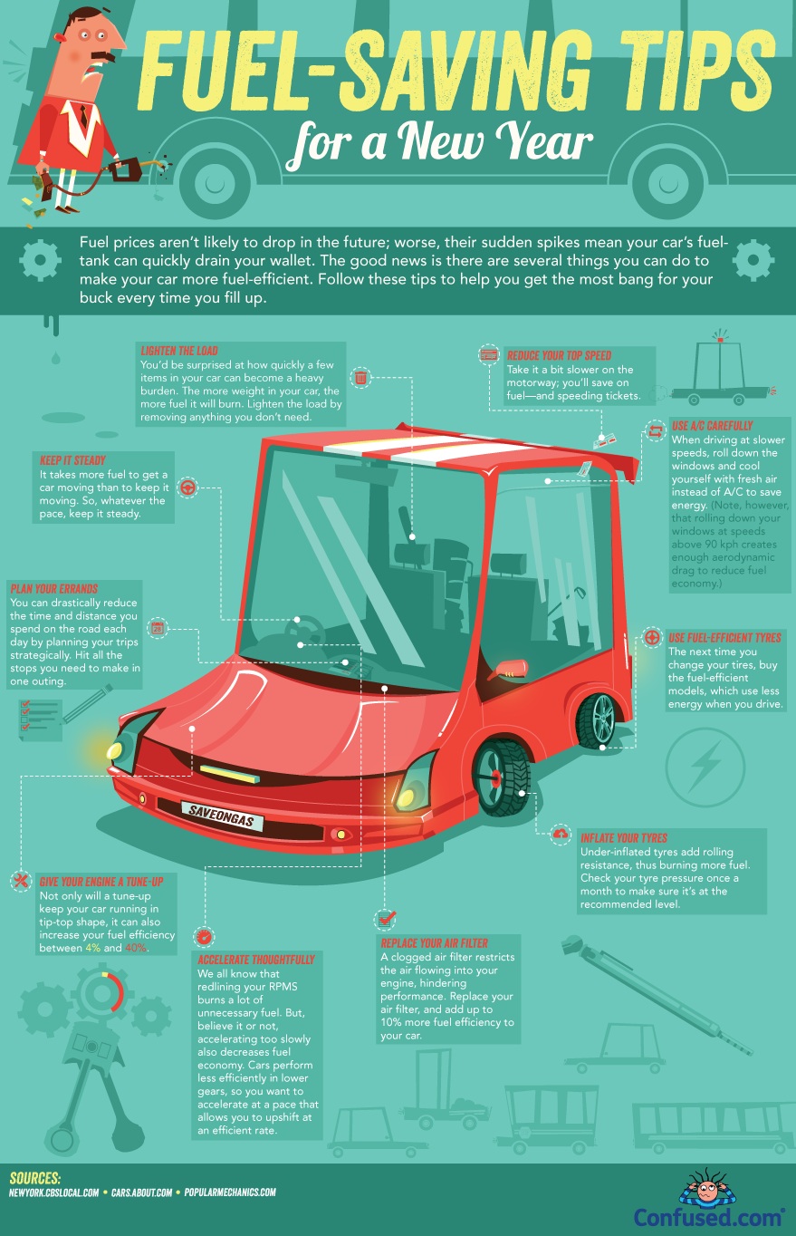
Most infographics are designed to convey a message in a visually stunning fashion that allows the viewer to digest large amounts of information through the fastest method of transfer available: visually. Sometimes, the results can have a different effect.
When you view the infographic below from Confused, you’ll see that it’s intended to give useful tips to those who want to save on gas. It’s a worthy effort, visually pleasing, and with enough tips to make it useful. However, there’s one other effect that comes from viewing it. Wouldn’t it make more sense to get a fuel-efficient vehicle rather than go through the processes described in the infographic.
Even the most conscientious gas saver has a hard time increasing their mileage by 4 MPGs. If I worked at a car dealership that sold high MPG vehicles, I’d have this puppy hanging in every office. Again, it’s not a bad infographic, but it goes to show that sometimes there are other effects that can come from visualizations.


You need to be a member of DealerELITE.net to add comments!
Join DealerELITE.net